List of Controls - Kenzap Cloud Pages
To enhance the customisation capabilities of your layouts you can rely on various built-in Control elements.
This guide describes all available Controls that can be used to build custom layout components.
: text
"filters": {
  "input": "textarea",
  "title": "Global filters",
  "value": "All\nPopular\nDesign\nCreative\nInteractive",
  "default": "art",
  "rows": "5",
  "hint": "Specify gallery filters to sort images interactively."
}
This Control will generate a simple one-row text input field, for example:
Parameters:
- input - the type of the Control element.
- title - the title of the Control element in the editor.
- value - default pre-entered value.
- default - placeholder value when value is missing or removed by the user.
- hint - hint text located below the Control element.
: textarea
"filters": {
  "input": "textarea",
  "title": "Global filters",
  "value": "All\nPopular\nDesign\nCreative\nInteractive",
  "default": "art",
  "rows": "5",
  "hint": "Specify gallery filters to sort images interactively."
}
This Control will generate a simple multi-row text input field, for example:

Parameters:
- input - the type of the Control element.
- title - the title of the Control element in the editor.
- value - default pre-entered value.
- default - placeholder value when value is missing or removed by the user.
- rows - number of visible rows of the textarea element before the scroll is initiated.
- hint - hint text located below the Control element.
: number
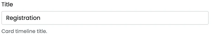
"title": {
  "input": "number",
  "title": "Title",
  "value": "200",
  "default": "",
  "hint": "Card timeline title."
}
This Control will generate a simple one-row number-only input field, for example:

Parameters:
- input - the type of the Control element.
- title - the title of the Control element in the editor.
- value - default pre-entered value.
- default - placeholder value when value is missing or removed by the user.
- hint - hint text located below the Control element.
: range
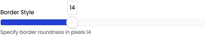
"border": {
  "input": "range",
  "title": "Border Style",
  "value": "14",
  "default": "4",
  "min": "0",
  "max": "40",
  "hint": "Specify border roundness in pixels"
}
This Control will generate a range slider number picker, for example:
Parameters:
- input - the type of the Control element.
- title - the title of the Control element in the editor.
- value - default pre-entered value.
- default - placeholder value when value is missing or removed by the user.
- min - min value of the slider.
- max - max value of the slider.
- hint - hint text located below the Control element.
: radio
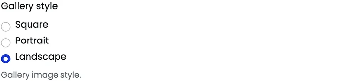
"style": {
  "input": "radio",
  "title": "Gallery style",
  "options": [
    {
      "key": "kp-square",
      "value": "Square"
    },
    {
      "key": "kp-vertical",
      "value": "Portrait"
    },
    {
      "key": "kp-horizontal",
      "value": "Landscape"
    }
  ],
  "value": "kp-horizontal",
  "default": "",
  "hint": "Gallery image style."
}
This Control will generate a radio picker element with predefined options, for example:
Parameters:
- input - the type of the Control element.
- title - the title of the Control element in the editor.
- value - default pre-entered value.
- default - placeholder value when value is missing or removed by the user.
- options - an array of custom options objects.
- hint - hint text located below the Control element.
: font
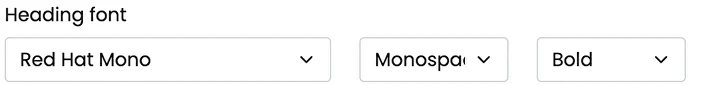
"font": {
  "input": "radio",
  "title": "Heading font",
  "value": "",
  "default": "",
  "hint": "Gallery image style."
}
This Control will generate a Google fonts dropdown element, for example:
Parameters:
- input - the type of the Control element.
- title - the title of the Control element in the editor.
- value - default pre-entered value.
- default - placeholder value when value is missing or removed by the user.
- hint - hint text located below the Control element.
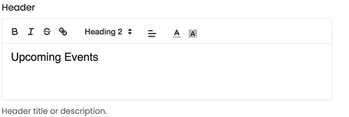
: richtext
"header": {
  "input": "richtext",
  "title": "Header",
  "value": "<h2>Upcoming Events</h2>",
  "default": "",
  "hint": "Header title or description."
}
This Control will generate a rich text editor element, for example:
Parameters:
- input - the type of the Control element.
- title - the title of the Control element in the editor.
- value - default pre-entered value.
- default - placeholder value when value is missing or removed by the user.
- hint - hint text located below the Control element.
: toggle
"animation": {
  "input": "toggle",
  "title": "Animation effect",
  "value": "1",
  "default": "",
  "hint": "Animate on hover"
}
This Control will generate a rich toggle on/off button element, for example:

Parameters:
- input - the type of the Control element.
- title - the title of the Control element in the editor.
- value - default pre-entered value.
- default - placeholder value when value is missing or removed by the user.
- hint - hint text located below the Control element.
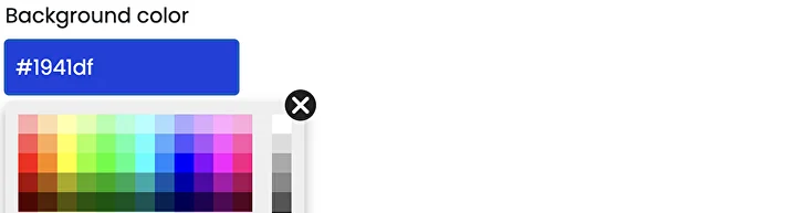
: color
"bgcolor": {
  "input": "color",
  "title": "Background color",
  "value": "#1941df"",
  "default": "#1941df"",
  "hint": "Background color overlay"
}
This Control will generate a color picker element, for example:
Parameters:
- input - the type of the Control element.
- title - the title of the Control element in the editor.
- value - default pre-entered value of color in HEX format.
- default - placeholder value when value is missing or removed by the user.
- hint - hint text located below the Control element.
: image
"bgcolor": {
  "input": "image",
  "title": "Image",
  "value": "https://static.kenzap.com/layouts/image.jpg",
  "default": "",
  "sizes": [
    "300x300",
    "1400"
  ],
  "hint": "Recommended image size is 1400px wide."
}
This Control will generate an image picker element, upload the image to the Cloud CDN and create resized copies of the image as defined in the sizes array, for example:

To access the image refer to the regional CDN link, for example, to access the resized image from Singapore servers. Note that all images are converted to WebP image format by default.
https://kenzap-sites.oss-ap-southeast-1.aliyuncs.com/S1003165/1003165-YNqyrQLvSYey-300x300.webp
Where
- 1003165 - is the user's Cloud space id
- YNqyrQLvSYey - is the actual ID of the image
- 300x300 - image size
Extension
Need to have more Controls? Lets us know and we can build together.