Frontend Development - Kenzap Cloud Pages
It is possible to extend the functionality of the Cloud and build applications, APIs and progressive web pages that can be used by a community or organisations on a monthly subscription basis.
The image below represents an example of how someone is searching for a component to build their page on.

This guide specifically focuses on frontend development for the Cloud. After getting through this guide you should be able to build custom layout components that are universally accessible from any Cloud space by any Cloud customer.
Prerequisites
Before continuing please install Node Package Manager (npm) from the official web page.
General knowledge of SCSS, HTML and JavaScript ES.Next.
It is also recommended to have some basic HTML and CSS code that you would like to integrate into the Cloud, for example, this can be an about us, contact, banner or some info box section. You can get some examples on CodePen.
1. Register Layout
You need to register your layout first before you can start developing it. Go to the Pages then switch to developer mode as shown in the image below.

Then click on the Create layout button and provide the layout title and template name as shown in the image below.

Once the layout is created, click on three dots > edit. In a popup window you can add additional information about your layout such as:
- Version - version control of your layout
- Description - a more detailed description of your layout
- Keywords - search keywords
- Repository - Github repo, used for CI/CD verification
- Preview - preview image of the layout
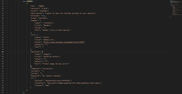
You can also view the HTML, JS, SCSS and JSON data structures of your layout as shown in the image below.
 Please keep in mind that the data in this section will only show up once the layout is created and uploaded to Github.
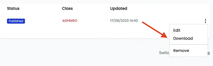
2. Download Template
To speed up the development process, download the template source directly from the Cloud by clicking on the three dots > download link in the developer table as shown in the image below.
This will map all necessary data and prefix custom Class to the source code files.
To avoid compatibility issues with other layouts always prefix your CSS rules and JavaScript classes with the unique class identifier name assigned to your layout.
We will get to this in more detail in the next section but a brief example of prefixing CSS rules looks the following way:
.kGHM6O .container {
  max-width: 1168px;
  padding: 0 16px;
  margin: 0 auto;
}
After the template is downloaded, unzip it. Depending on the name given to your layout its structure may look the following way.

3. Launch Template
In the terminal navigate to the root folder of your template. For example,
cd /Users/pavellukasenko/Downloads/universal
Make sure to change it to your path, then run:
npm i
to install project dependencies. After that run
npm run watch
It will launch a new tab in your default browser under port 3000. From now on you should be able to perform live code updates and see changes immediately reflected in the browser.
If for any reason the browser window does not open, type http://localhost:3000 manually.
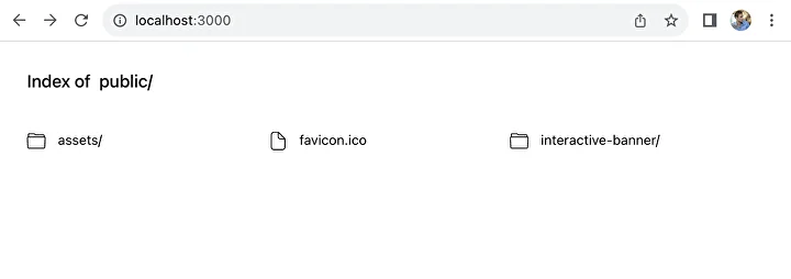 To navigate to your layout simply click the interactive-banner link. Note, that the name may differ here depending on your initial project settings.
Currently, the page should produce an empty response.
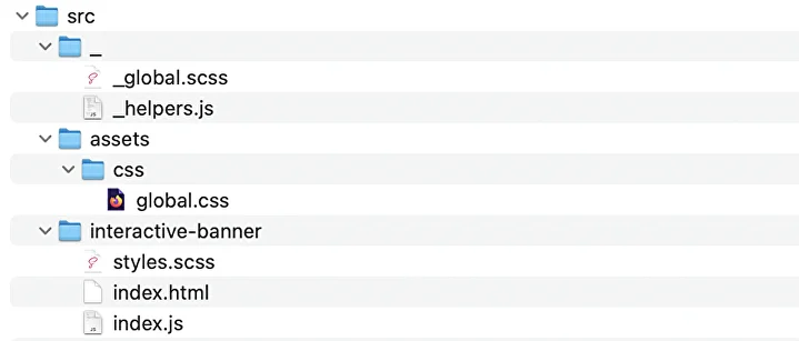
4. Understand Structure
All coding work happens in the src folder of your project.
- _ folder contains JavaScript dependencies, helping methods and reusable components. These can be simple date formatting functions or reusable components such as the sign-in popup window.
- assets folder contains static resources of the project, such as the images, JS or CSS libraries.
- your-layout-name or interactive-banner in this example contains three main entry files that define the layout.
- styles.scss - contains all styling rules of the layout.
- index.js - maps Cloud data with HTML structure to render pages dynamically.
- index.html - browser entry point to call index.js and styles.scss files.
5. Add Controls
Open index.html file to add additional controls to the layout. A control can be an input text field, color picker or range slider to name a few. Refer to a complete list of available controls.
The image below shows an example of three controls with the following type:
- color - fires color picker for the Background Color
- toggle - creates on/off button for banner parallax effect
- text - creates input field for banner subtitle
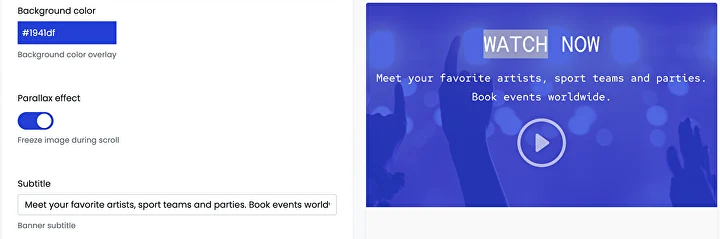
Controls play a crucial role in how users can customise layouts when designing their Cloud products.
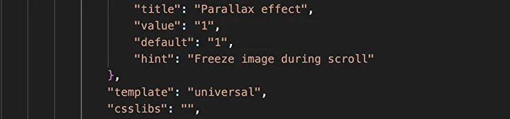
For example, let's add a toggle button element to the index.html file. The code for a toggle button:
"parallax": {
  "input": "toggle",
  "title": "Parallax effect",
  "value": "1",
  "default": "1",
  "hint": "Freeze image during scroll"
}
When the user turns the toggle element on the value will equal 1, and vice versa, when the user turns the toggle element off the value will equal 0.
When you place the code into the index.html file it will look the following way:
Make sure to keep the integrity of the JSON structure so it does not break the JavaScript code later.
For example, the last element before the closing bracket should not contain a comma ("Freeze image during scroll").
You can add more controls and extend the customisation capabilities of your layout in future releases.
6. Prefix Styles
The SCSS code for this tutorial is taken from the CodePen banner example.
When you define the styles in the styles.scss file of your layout you need to prefix every single CSS rule in order to avoid styling conflicts with other elements of other developers.
The image below shows an example of how CSS rules are prefixed with .kGHM6O class.

You should replace it with the class that is provided in your developer table.

7. Write JS Code
Writing JavaScript code in index.js is the most fundamental part of creating component layouts.
When you open the index.js file, you should be able to see the following code structure.
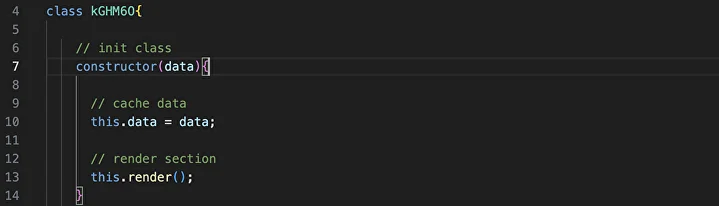
The main Class of index.js file is named after the Class that is provided in your developer table.
The data variable contains a JSON structure of all controls defined in the index.html file.
The data variables are used to personalise component design and structure based on the user-provided inputs.
Eventually, the render method is called to map the layout's HTML code with the control's parameters.

You may have already noticed that the section and its child div HTML tags are assigned custom classes and styles. They are used to guarantee the design system's consistency when multiple components are combined together.
The design system refers to:
- Spacing system
- Responsive behaviour
- Color, and background settings
Now let's add the missing part to the index.js file, which is the div and iframe tags.
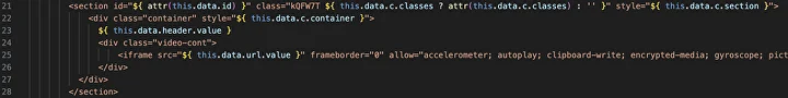
The iframe code is taken directly from the YouTube share > embed video popup window.
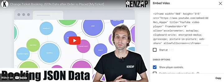
The iframe src attribute is replaced with the URL control value.
this.data.url.value
This declaration points to the Control's URL value that was declared in the index.html file.
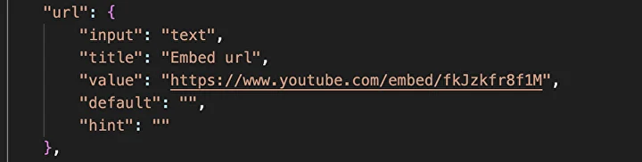
In such a way, when users customise their layout component in the Cloud the url.value parameter is updated and an updated HTML code is generated.
8. Create a Preview Image
Provide an amazing preview image for your layout when it is ready for use. You can use a placeholder image and place a screenshot of your layout inside of it so that your layout preview looks more branded when users are searching for it.

9. Commit to Github
To ensure a convenient CI/CD environment you need to upload your code changes to GitHub first.
Note, that in future you can package multiple layouts into one repository. The Cloud will automatically link the repository to layouts declared in the developer table.
The image below represents the Github repository creation process.
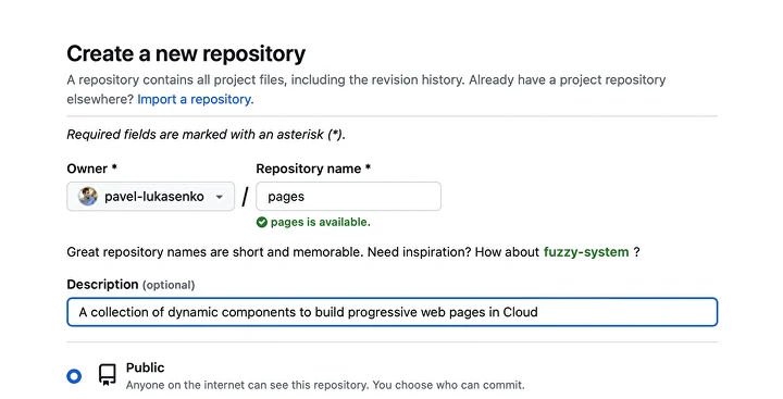
Important! Make sure to prefix your repository name with pages-. For example, if you want to name your repository universal, name it pages-universal instead.
Now that the repository is created you need to make sure that it is updated in the Pages > Developer table as shown in the image below.

The last step is to add a Cloud webhook that triggers a request to synchronise codes whenever there is an update or commit in GitHub.
 Go to your repository settings > webhooks > add webhook and provide the URL in the following format:
https://push.kenzap.cloud/{your GitHub channel}/{repository name}/
Replace {your GitHub channel} and {your repository name} and commit your first layout component to the Cloud.
10. Test in the Cloud
Now you can go to Pages, create a site and add the first page and search for your layout.

Do let us know if you have any questions and see you in the Cloud.